Pages in this section:
List view
4️⃣ Section 4: Analysis
🔎 Analysing a file
📚 The Library
📃 The Report tab
📃 The Analysis tab
📷 Screenshotting your maps
✨ Transforms Filters: Tracing paths
✨ Transforms Filters: Zoom
✨ Transforms Filters: Focus or exclude factors
✨ Transforms Filters: Top factors and links
✨ Transforms Filters: Combine opposites
✨ Transforms Filters: Remove brackets
✨ Transforms Filters: Include or exclude hashtags
✨ Transforms Filters: Collapse factors
✨ Transforms Filters: Autocluster
✨ Transforms Filters: 🧲 Magnetic labels
🎨 Formatters: Overview
🎨 Formatters: Link label position
🎨 Formatters: Labels
🎨 Formatters: Labels - Tally
🎨 Formatters: Labels - Surprise
🎨 Formatters: Sizes
🎨 Formatters: Colour factor text red
🎨 Formatters: Translation
🎨 Formatters: Colour links
🎨 Formatters: Colour factors
🎨 Formatters: Label wrapping
🎨 Formatters: Factor spacing
📊Tables tab overview
🔗 The Links Table
👥 The Sources Table
📊 The Factors table
📜 The Statements Table
💬 The Mentions Table
❓ The Questions Table
⚒️ The Closed Question Blocks Table
📕 Comparisons
All sections:
Zoom
If you are using hierarchical aka nested coding, you can use ordinary zooming to “zoom out” your map to give a simple, more general overview. But sometimes this can mean oversimplifying your map: there are lower-level factors which are so important and popular that it is unhelpful or even misleading to roll them up into a parent factor. Smart zooming solves that problem.
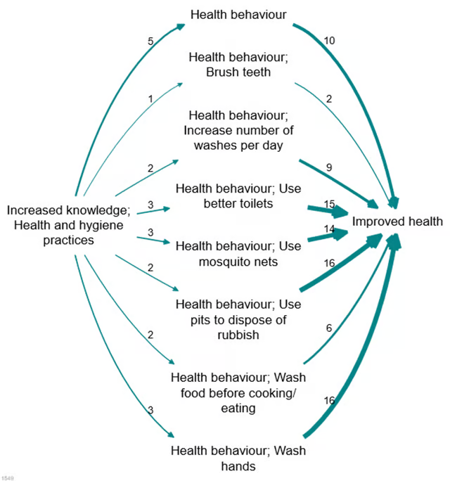
Assuming we have a causal map which has used nested coding, as in the small but detailed map shown above, how do we take advantage of this coding to “zoom out”?
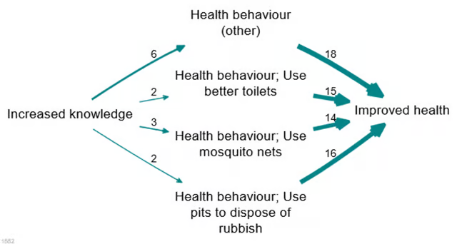
Here is the same map, zoomed out to level 1 (i.e. there are no semi-colons at all).

A weakness of hierarchical zooming is already visible in the example, we have lost a lot of the important detail. In many cases we may be happy to see all the factors “rolled up” to the top level but in the above example, there are a variety of types of health behaviour discussed and this detail has been lost. So what can we do?
A smarter approach is achievable with this smart zooming, which tells the app: only “roll up” a nested factor into a higher-level factor if it has a frequency (simple frequency, or source count) lower than some cut-off value; otherwise, keep it separate.
This is an improvement over zooming because it keeps the detail where necessary and removes it where it is not. It will roll up infrequent factors into their parents but only if they are infrequent; if you have a very granular factor like “health behaviour; Use better toilets” which actually has a lot of mentions, then it won’t get rolled up.
The above example can be rolled up to this:
This is an improvement because it still has a small number of factors, retaining frequently-mentioned factors but wrapping up infrequently-mentioned detail into higher-level concepts.
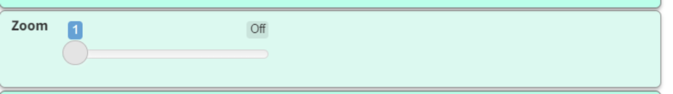
You can use the slider button to chose the level you want to zoom to. 1 means just top-level factors, which means that you’ll only see the factors on top of the hierarchy. The higher the number you choose, the greater level of detail your map will have
Remember that order matters: the order in which the filters are applied makes a difference.
Smart zoom [this filter is deprecated! ❌]
Summary
If you slide the smart zoom cutoff slider to say 4, then any lower-level factors which are themselves mentioned by at least 4 sources will not get wrapped up into the parent (if you have the radio button switched to sources). If you switch it to citations, factors mentioned in at least 4 citations will not get wrapped up into the parent.
Details
I always use hierarchical coding when coding as it gives me the option of presenting the larger overview or the finer details. It lets me create labels like Increased knowledge; Farming method/ practice which can also be grouped together with other factors like Increased knowledge; Markets and displayed just as Increased knowledge when “zooming out”. However, until smart-zooming came along this was presenting some difficult decisions when creating my maps.
Zooming out to show the larger picture is appropriate for overview maps and is a great way to show my audience the big stories of change. However, when looking in more detail about specific drivers of change this sometimes led to over-simplifying my maps. Especially in cases when although the parent-factor was the same, some of the lower-level factors were really important (and frequently mentioned) in their own right and it seemed misleading to roll them all up together.
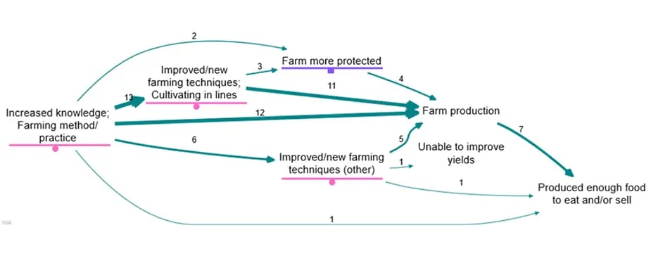
Before the smart-zooming feature, leaving them ‘zoomed in’ was the only other option and this sometimes led to displaying too much detail. For example, in the map above I want to keep my audiences focus on how the improved/new farming techniques led to increased farm production, so details such as whether the farm was more protected from animals or wildfire is unnecessary and distracting from the main story.
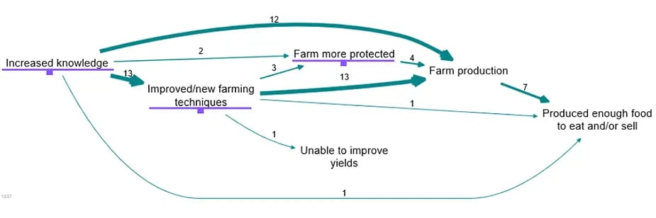
Here is that same map zoomed out to level one, the underlined factor labels are the factors that have been ‘rolled up’. It is easier to read but I have lost a lot of the detail, such as what type of knowledge drove these changes.
Enter smart-zooming! With smart-zooming I can enter a source count (number of sources who mentioned a particular link) and any link with a count lower than that number gets rolled up, whilst the rest are preserved. (Alternatively I can use citation count as criterion if I want.)
In the map above the factor labels underline in purple have been rolled up and those underlined in pink have been preserved. I am able to present the main stories of change without distracting people with the links with small counts. In the above map I have set this number to 10, which is the default. As you can see I still have all the detail I wanted to present, such as the type of knowledge respondents had gained but none of the distracting little links. Lower level factors ‘use of fertiliser’ and ‘use of water pump’ have been rolled up into ‘Improved/new farming techniques (other)’ so it is clear there is variety within this factor but the unnecessary detail is not displayed as less than 10 sources mentioned each link.
If I had simply zoomed out, my audience would have not known that cultivating in lines was the most common improved/new farming techniques driving change. Using smart-zooming I can clearly present the most important stories of change.1`