Pages in this section:
List view
4️⃣ Section 4: Analysis
🔎 Analysing a file
📚 The Library
📃 The Report tab
📃 The Analysis tab
📷 Screenshotting your maps
✨ Transforms Filters: Tracing paths
✨ Transforms Filters: Zoom
✨ Transforms Filters: Focus or exclude factors
✨ Transforms Filters: Top factors and links
✨ Transforms Filters: Combine opposites
✨ Transforms Filters: Remove brackets
✨ Transforms Filters: Include or exclude hashtags
✨ Transforms Filters: Collapse factors
✨ Transforms Filters: Autocluster
✨ Transforms Filters: 🧲 Magnetic labels
🎨 Formatters: Overview
🎨 Formatters: Link label position
🎨 Formatters: Labels
🎨 Formatters: Labels - Tally
🎨 Formatters: Labels - Surprise
🎨 Formatters: Sizes
🎨 Formatters: Colour factor text red
🎨 Formatters: Translation
🎨 Formatters: Colour links
🎨 Formatters: Colour factors
🎨 Formatters: Label wrapping
🎨 Formatters: Factor spacing
📊Tables tab overview
🔗 The Links Table
👥 The Sources Table
📊 The Factors table
📜 The Statements Table
💬 The Mentions Table
❓ The Questions Table
⚒️ The Closed Question Blocks Table
📕 Comparisons
All sections:
The Analysis tab
These tabs go under your map and were designed to help you analyse your map. They are sensitive to the filters you are using in your map, so be mindful on how you read the information contained in them.
They were designed to help identify patterns and differences in how causal links were mentioned across different questions and demographic groups in your data. It provides automated analysis to surface insights about how responses varied.
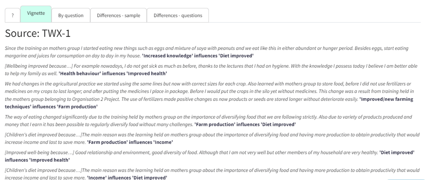
Vignette
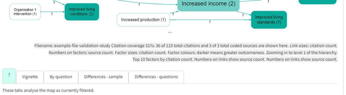
This tab picks one source from the map and shows a typical story or causal path from the map
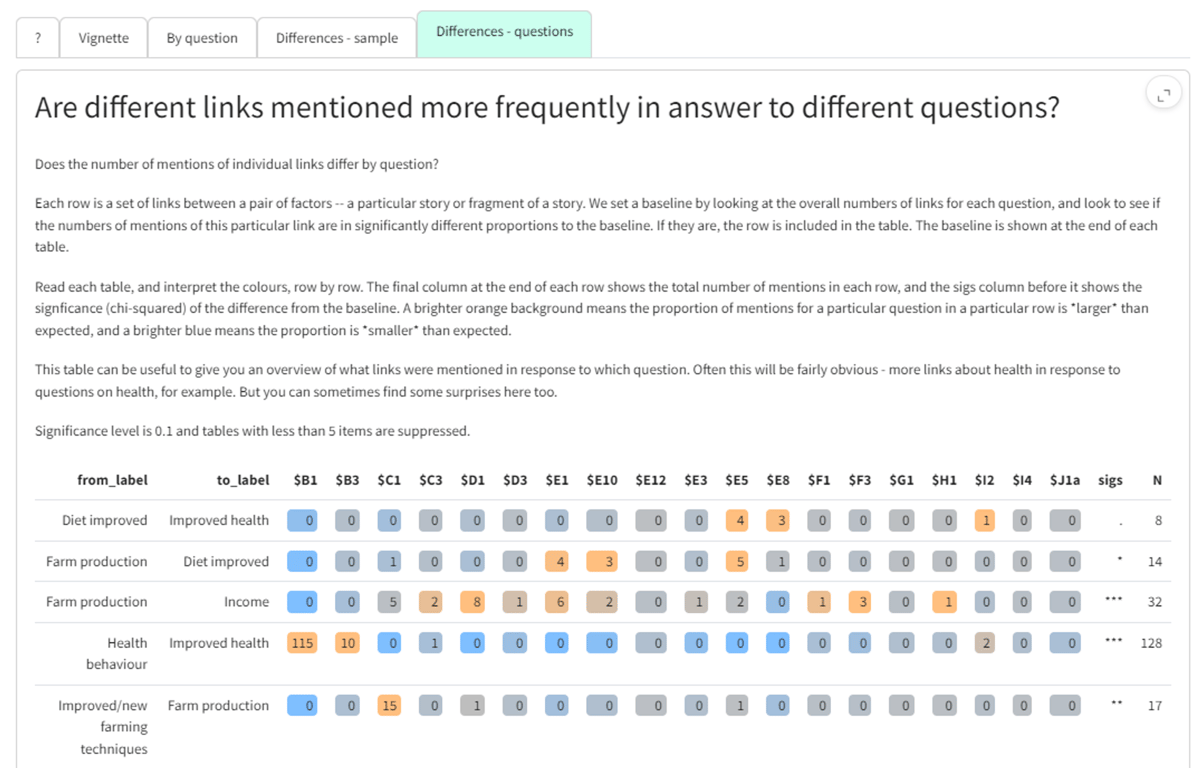
Differences - questions
This shows which links were preferentially mentioned in answer to different questions. It allows you to see how responses varied across different questions in your data.
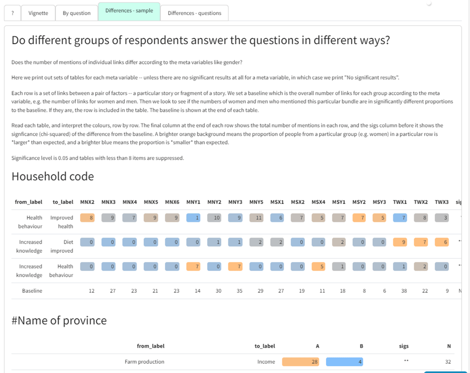
Differences - sample
Shows which links were preferentially mentioned according to different groups e.g. women more than men. We ask:
does the proportion of women vs men who mention this link differ from what you would expect (given the total number of mentions of links by both women vs men)?
ㅤ | Women | Men |
... other links ... | ㅤ | ㅤ |
Number of mentions of the link from X to Y | 10 | 9 |
... other links ... | ㅤ | ㅤ |
Total number of mentions of any link | 60 | 10 |
In this case we can see that although women mentioned the link slightly more often than men, women altogether mentioned links twice as often as men. So we can compare the number of mentions of the link with the number of "non-mentions" of the link. So we can work out this table (not shown).
ㅤ | Women | Men |
Number of mentions of the link from X to Y | 10 | 9 |
Number of mentions of any other link | 50 | 1 |
We can do a simple chi-squared test on this table to see if the ratio 10:9 is significantly different from 50:1 (which of course it is) -- this is the same question as to whether 10:50 is significantly different from 9:1 (which of course it is). If this test is significant, the row "Number of mentions of the link from X to Y" is shown in the table, and the intensity of the colouring of each cell reflects its chi-squared residual, i.e. how different is the number it contains from the number you would expect, given the other numbers?
This comparison is agnostic as to whether there are, say, many men or a few men who talk a lot.
At the moment, the tests for this are chi-squared tests which would not give special treatment groups which are actually ordinal e.g. low income, medium income, high income: the chi-squared test is weaker than it should be.