Pages in this section:
List view
4️⃣ Section 4: Analysis
🔎 Analysing a file
📚 The Library
📃 The Report tab
📃 The Analysis tab
📷 Screenshotting your maps
✨ Transforms Filters: Tracing paths
✨ Transforms Filters: Zoom
✨ Transforms Filters: Focus or exclude factors
✨ Transforms Filters: Top factors and links
✨ Transforms Filters: Combine opposites
✨ Transforms Filters: Remove brackets
✨ Transforms Filters: Include or exclude hashtags
✨ Transforms Filters: Collapse factors
✨ Transforms Filters: Autocluster
✨ Transforms Filters: 🧲 Magnetic labels
🎨 Formatters: Overview
🎨 Formatters: Link label position
🎨 Formatters: Labels
🎨 Formatters: Labels - Tally
🎨 Formatters: Labels - Surprise
🎨 Formatters: Sizes
🎨 Formatters: Colour factor text red
🎨 Formatters: Translation
🎨 Formatters: Colour links
🎨 Formatters: Colour factors
🎨 Formatters: Label wrapping
🎨 Formatters: Factor spacing
📊Tables tab overview
🔗 The Links Table
👥 The Sources Table
📊 The Factors table
📜 The Statements Table
💬 The Mentions Table
❓ The Questions Table
⚒️ The Closed Question Blocks Table
📕 Comparisons
All sections:
⚒️ Comparing maps between particular groups
See this page for showing different groups on the labels:
🎨 Formatters: Labels - SurpriseFiltering by respondent group
We code a causal map on the basis of text data. That text data can be usefully broken up into statements, usually of a length between a paragraph and a page. Each statement usually has “additional data” associated with it, for example the ID or gender of the respondent, the text of a question to which this statement is an answer, the page and name of the document from which this statement comes, etc. When we code a causal claim within a statement, we can associate the resulting link with the additional data. That means that for every link, we should know the additional data, e.g. the gender of the respondent, etc.
We call the set of statements corresponding to a particular value of a particular additional data field a “group”. This definition of “group” is quite broad and does not have to refer only to respondents, e.g. the group for “question 3” is the subset of all the data relevant to that question.

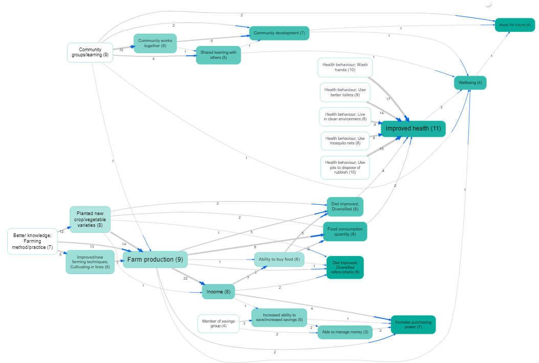
It is easy to filter a causal map by this additional data. This idea goes back at least to (Ford & Hegarty, 1984). For example, here is one map filtered to show all and only the links mentioned by with female respondents. We call these the per-value maps, e.g. the map consisting of all links mentioned by women. However, often the maps for different groups are quite similar as a large proportion of links are shared. When there are many links as in this example, the resulting filtered maps can be uninformative.

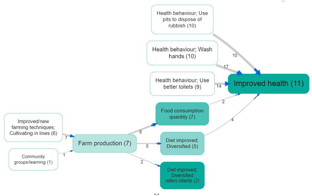
There may still be a bewildering hairball of links. We can apply techniques like hierarchical coding to “zoom out” of the map, or simply show only the most frequent factors. This map shows the top five factors for women:

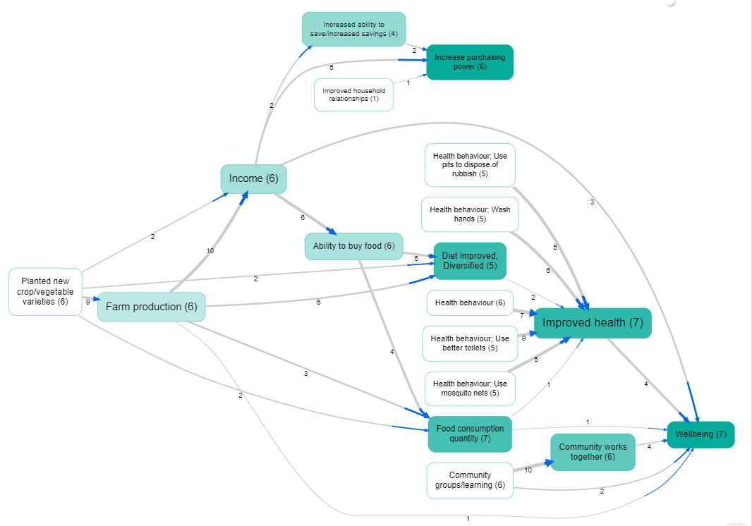
And this map shows only the top five factors for men
